Showing posts with label Assignment 2. Show all posts

Sunday, February 3, 2013

Assignment 2: Final Revision


In my original commentary on this assignment, I made the following comment in the notes on learning:
“I consider this to be the most complete project I have yet to undertake as a photographer, it stretched me in so many different ways, physically and intellectually.  I hope that the assignment set works as well as the book, 13 photographs is a tough ask for such a diverse event.”
This comment was prescient.  The assignment essentially failed as a body of work, due in large part to the fact that I put too much of my energy into the creation of the book.  The book became the assignment, but this is not what was asked for.  The result was that I created the assignment as a summary of the photobook, rather than the other way around.  I each of my past 3 courses I expanded one of the assignments into a broader based study which then became a photobook.  However, as this was after the fact it did not interfere with the assignment.

Photobooks are an important part of how I think about and practise photography.  I find a narrative sequence of images far more satisfying than a single work of art.  I enjoy a monumental photograph, I much admire Andreas Gursky, but I find the photobooks of Martin Parr much more engaging as an art form.  My direction is pages in a book, not pictures on a gallery wall.  This is creating conflict in my studies, OCA assignments are on the whole a small set of images, generally fewer than 12.  I find this very hard to achieve; my comfort zone is 30-80 images. Perhaps I am copping out from making the hard decisions that a commercial photo editor might make.  I feel that the current courses are set up to drive towards the ability to satisfy a commercial brief, rather than for the artistic goal of an individual.  As I am engaged in this course to expand my photographic sensibilities as an artist, with no intent towards a career as a photographer, I have recently started to question whether I really want to continue with the OCA – there, I finally said it.

In effect this assignment has pushed me into a crisis of confidence and commitment, it has forced me to take a hard look at myself and my motivations.  For 3 years I have spent an average of 10-15 hours a week engaged in the pursuit of a degree.  I work 50-60 hours a week in a very demanding job, photography is the antidote to the long hours and stress, but now my photography is generating even more stress.  Why do I do it?  Vanity, maybe, I want to still prove my mind is capable of advanced study? Relaxation, well that went out the window a while ago?  Qualification, I already have 2 degrees and another postgraduate qualification? So why?

It is because I really enjoy the process of making pictures. I love the intellectual challenge of solving a pictorial puzzle and creating a photograph that entertains and challenges the viewer.

So the real question I must answer is how to pull myself back to a place where I am once again enjoying what I do and expressing how I see the world through photography.  I have an opinion about the world and a need to express it visually.  This is where I failed in this assignment, I dropped the opinion and tried to create an objective balanced piece of work.  As I did this I stopped relating to my subject and stepped into the position of an observer, even worse a voyeur.  I took too many photographs trying to document every aspect of the Fest and then present that in a book as a balanced view of the event.  As a book this worked well enough and I am very pleased with the outcome.  However, there was no practical way to reduce this to 12 or so images and retain the objective overview without resulting in a bland set of images.

In essence, by attempting to balance the set, I removed the more cutting images, afraid of projecting my opinion into the set of photographs – the net result a bland bunch of colourful snaps.  When I worked on my Landscape photographs I placed my personality directly into the images.  I am a geometry obsessed picture straightener and I used this to create a specific look to the photographs that conveyed a sense of Shaun.  With the subject of the Fest this was more difficult, I did not have the time to plan each and every frame, and I got lost in the chaos of the event.

Now the question, what am I going to make of this.  It is over 10 weeks since I submitted the original assignment. During that time I have taken a very deliberate break from my studies, giving myself a chance to clear my head and rethink my approach.  The answer is to return to where I was with Landscape.  I am not a disinterested observer, I have a strong viewpoint that I want to get across in my work.  Secondly I need to get back to my core interest in photography, the urban environment and the existence of people within the spaces they have created.  I find that my Landscape photographs have more Social Documentary in them than the images I have created for this course.

Assingment 2: Rework

When I started out with this study of the Oktoberfest my original plan was to document the seedy side of the event, to lift the carpet and show what is swept beneath.  The Fest has a very carefully constructed public image, one that the city is very keen to preserve, 100’s of millions of Euros flow from the event into Munich every year.  The newspapers always comment on the darker side, but the picture they portray is almost universally one of jolly lads in Lederhosen swigging gigantic beers and young ladies keen to make the most of their cleavage.  I rarely see the negative, even the shots of drunks tend to be humorous; this is one of mine, similar shots are frequently shown in the press:


The crutches add to the comic element, a bunch of lads sleeping it off.  What is never shown, however, are the fights, the people lying in sick and piss, the urgency of paramedics racing through the crowd to someone asphyxiating on their own vomit.  Worse still is the sense of sexual menace that permeates an event in which almost everyone gets seriously drunk.  Leering grabby men are everywhere, few women will get through an evening without some form of harassment, although many give as good as they get.  Sadly, sexual assault, even rape is not uncommon common at the Fest.  Many visitors have little recollection of where or what they did the night before.  Informed consent, no chance, although again it works both ways.

When I originally set out to illustrate this side of the event, this was the side that I wanted to portray, for a variety of reasons I bottled it.  I have now revisited those photographs and constructed an alternate narrative of the event, visiting on the darker side.  This is how I see the Oktoberfest, away from the picture postcards.  I have taken the 13 images that I submitted for the assignment and made a severe edit.  6 of the 13 remain, to which I have added 7 new photographs.  Of the 6 that I have kept all have been edited for framing.   In the new set I have freely cropped the photos without any limit of aspect ratio.  

My final and perhaps very risky move is a decision to switch the set to B&W.  When I first designed this assignment, it was the offshoot of a book project that had at its core, the colour of the Fest.  Changing the emphasis of the assignment to a darker view demands a rethink.  Visually B&W drives a graphical approach that places emphasis on the structure of the image.  The colour of the Fest that so dominated my earlier set is removed as a consideration, making the images less confusing and more focused.  It also enables better use of more marginal images, many of the seedier images were taken at or after nightfall under mixed lighting.  
However, this is not just about the picture qualities, the use of B&W has an effect on the viewer of the image that is outside the simple aesthetic impact.  B&W photographs are perceived as serious objects, they are reports not simply pictures.  By using B&W I can further emphasize that this is a documentary set that investigates and reveals, not simply illustrates.  

When I started out on this course I set out to shoot the whole thing in B&W, a direction that my tutor quite rightly questioned.  My reasons for using this medium were simply one of desiring to explore B&W across an extended period of time, not a bad thing, but also not terribly convincing.  He rightly pointed out that any decision regarding the qualities of my work should be for well thought out reasons.  With the Fest book, I used colour to portray the gaudy madness of this huge sprawling drinking event, it worked as intended.  Now that I am bringing focus to just a part of the event I have good reasons for using B&W.  During my Landscape course I shot 3 assignments and the portfolio in colour, the only assignment I shot in B&W was about the modern day presence of the Jewish synagogue in Munich, a subject that suited the darker tones of B&W.  

Learning

  • Technically there was little wrong with the original set of images, just an unwillingness to freely crop and frame the images to maximize the impact.  I think this stems from wanting tidiness in my work, something that worked in Landscape, but not here.  I need to always think about how the frame interacts with the image and treat the frame as a flexible tool.
  • Documentary photography is not science it is an art and as such permits opinions and the introduction of the practitioner’s personality and viewpoints into the work. In fact without doing so the risk is a bland set of images that merely record but do not engage.
  • The creation of Photobooks is central to how I want to develop as a photographer and is something I still see as the ultimate expression of my art.  However, I need to prioritize the demands of the course first.  I have a renewed commitment to what I am doing with the OCA and perhaps after this “crisis” I can get back into it with greater vigor and enthusiasm.

Reworked Photographs


This is how the world wants you to see the Oktoberfest, drunken of course, but happy.  The camaraderie of two revellers set against girls wearing Drindls and a sign welcoming all to the “Augustiner Garten”.  OK, that really is a great place to drink some really fine beer.

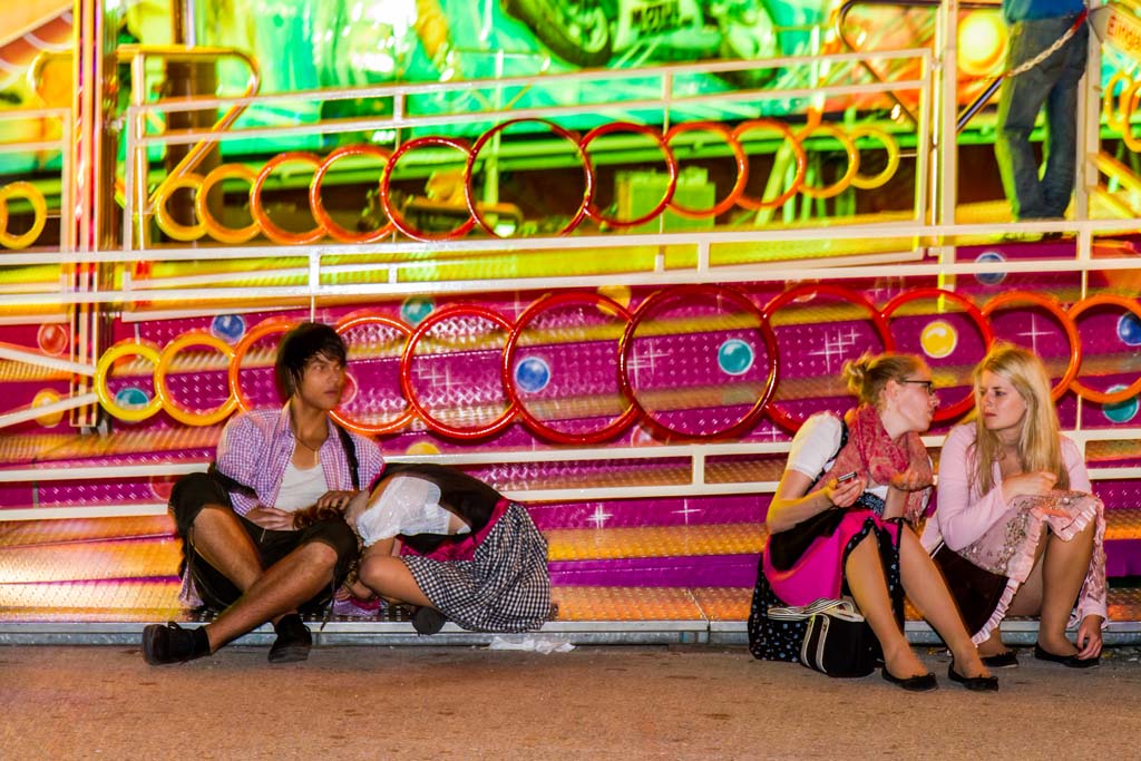
Among the broken glass, cigarette butts, and detritus of a day at the Fest a young couple find somewhere to escape from the chaos of the event.  By mid-afternoon the event is full and finding somewhere to sit and have a beer becomes a challenge. This is a rare departure from the horizontal for me, tilting the frame adds a dynamic to an otherwise static image.  I also want to convey the sense of disorientation that the Fest engenders after spending any time there.


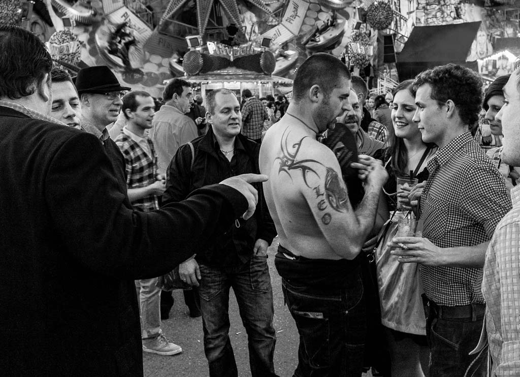
As the light falls the Wiesn becomes more intense, the crowds thicken and the music gets louder.  Everywhere you go there is drink. I have cropped this image much tighter to bring the emphasis to the tattooed man.  In my first submission I allowed much more of the background into this and several other photographs, the goal being to illustrate the event as well as the interaction.  This took the point of focus away from what I was trying to say.

Drunks lurch around the fairground, I become part of the game of jumping in front of cameras for a laugh.  In this case he made the photograph. Once again I have heavily cropped the original image to tighten the sense of his interacting with me and emphasizing the repetition of face in the billboard behind. 

This is a gently humorous look at the effect drinking 6% alcohol beer in 1 litre glasses, often with a Schnapps to chase it down.  I have tightened the crop to focus on the trio, removing the Hofbräu logo that was in the far left corner of the original.  The logo makes sense if you know something about the Fest, but without that knowledge it adds nothing whilst unbalancing the frame.

Forget the jolly opening image, this is how the Fest ends for many; wandering drunkenly soaked to the skin.  These two lads staggered across my viewfinder barely able to stand and utterly confused about who or where they were.

A frequent sight at the Fest, he just lost whatever it was he had for lunch. Equally frequent, though, is that people are rarely alone when drunk, there is a great deal of tenderness on display.  I have again cropped tightly to bring the centre of attention to the couple, but retained the boots in the background to suggest that they are part of a larger world.

There were a few chuckles, but these lads were taking good care of their comatose friend.  They had even taken their shirts off to help to keep him warm, hypothermia is a real risk for seriously drunk people at the Fest.  The Autumn air can be very cold and when coupled with rain can kill if someone escapes attention.

All too often the Fest ends badly for someone, alcohol poisoning or violence require attention from the emergency services.  They race through the crowd blowing whistles to alert people to make a path.

A sudden increase in the volume accompanied by crashing benches and breaking glass signifies that another fight has broken out.  Here we have one of the most primal of human interactions, violent confrontation.  This photograph nearly resulted in my joining the violence, the security guards were very aggressive about photo taking, something I reacted to badly.  That altercation, neatly illustrates the way that the Fest management want to control the message. 

Fest security is very efficient, start a fight and you will lose.  As with the previous image one or two of the bouncers took up position specifically to drive away photographers.  We call them the Black Sheriffs, they are known for their violence and I suspect a part of not wanting to be photographed is not wanting to be identified.  In a democratic world, when those in a position of power avoid being pictured as they go about their duties it is time to ratchet up the paranoia a little.

The come on! As night falls people start to pair off, the Fest is a major place for casual hook-ups.  Many go with the express intent of finding some casual sex, others simply take it.  Free condoms are distributed to try to manage disease transmission.  Conversely at least 3 couples we know first got it together at the Fest and are now happily married.  The Fest is a strange mix of contradictions.

The Fest is hard work, dancing drinking, shouting, many find a quiet place to chill a little before either heading back into the maelstrom or heading for the train home.  Others wake up in the room behind the wall they are leaning on and wish they hadn’t – the Wiesn Police Station.

Saturday, January 12, 2013

Assignment 2: Rethink

Well, it has taken a long time and a great deal of thought before beginning a response to my tutor's comments on assignment 2. Essentially the feedback was that I had produced a good set of photographs, but that I had missed the point.  I don't normally include the feedback in my blog, but this time I think it is important to add context to how I plan to respond.  These are the first 3 paragraphs in the comments:

  • You have continued to develop your own voice well with this assignment. I get the feeling that you are reconciling two different motivators - the need to meet the brief and following your own inclination concerning a particular photographic project connected with your own maturation.
  • You have succeeded in satisfying both aspects, but have been held back from following your natural inclination to fulfill the brief and in so doing have perhaps not succeeded with the brief as well as you are able. However, you have progressed very well in terms of progressing your own particular photographic development.
  • As before there is clearly a good deal of thought behind your work - including what you want to say and best to express this. You show good creativity and imagination in your execution of the work but your submissions lack a clarity in execution that I feel is born out of the split motivations referred to above.
This is not bad feedback, but it is quite critical and also valuable.  The key is the final sentence, a lack of clarity caused by split motivations.  It has taken me 6 weeks to work through my thoughts about this and get to the point where I feel comfortable enough to work a response.  I also had a long and useful conversation with my tutor around the assignment which helped me to understand where I had gone wrong.

The first and most fundamental problem was that I put all of my energies into developing the book concept and then created a set of images for the assignment submission as an afterthought.  In doing so I failed to editorialize my work and essentially presented a synopsis of the book with a nod toward human interaction.  I tried to be non-committal, objective, to avoid forming and presenting an opinion about the event I was documenting.  

I explored this theme in a previous blog entry, that asked questions about truth and objectivity in photography.  I considered a number of "opinions" that I could drive through my photographs of the Fest and was rather critical of Walker Evans' own editorialization of the photographs that illustrated "Let us Now Praise Famous Men".  This generated more comments on a blog entry than I have ever experienced, I think my choice of a sacred cow for a rather flippant critique touched a nerve - fair enough, with hindsight I now get it.  

Documentary photography need not be objective, indeed, it works better when the photographer has a statement that they want to make.  As with written journalism (thanks to Les Johnstone for making this point) photojournalism can have a viewpoint and project the political or social stance of the photographer.  This may seem obvious to some, but it was not to me.  I was laboring under the impression that I needed to avoid my own opinion of the event creeping into my images.

In summary, I presented a set of photographs that met the brief, but did little else.  What is worse is that the book contained material that could have produced a far more powerful assignment submission. My job now is to rework the assignment with this knowledge, taking on board the input from my tutor and adding something of myself into the set.  

My first decision must be where to take the assignment, what stance to adopt and why.  This is an easier decision than I thought it would be.  Whilst working at the Fest I progressively became overwhelmed by the excessive drunkenness and sense of impending violence that I observed as I walked around.  I was exploring the dark side of the event, both figuratively and literally, poking my camera into places the organizers would prefer to remain hidden.  What I was seeing was the impact of colossal drinking and the wreckage it left behind, an image of the Fest directly at odds with the jovial merriment the marketing wonks like to project.  I want my photographs to counter this image and convey that sense of menace and grime that is the other side of the Oktoberfest.  When I first set out with this project that was where I thought I would go, I chickened out.

The next step is to reassess the original assignment material, decide what to keep, what to adjust, and what to discard.  I then need to add new material to the set.  Waiting so long has allowed me to detach from the original material and approach it with a new mind.  Here are the 13 images submitted to my tutor marked up for edit:


In essence I am removing the more anodyne images, then editing the remainder for greater impact:


Although I am planning something dark, I still need one or two images that contrast that point, so not all of these are so gloomy.  However, all contain drink and most a degree of threat or collapse.  My next task having removed 6 images is to think about how to replace them.  That will be the next step and a process that might also result in changes to the above images.  I have 24 images (including the above) from which to select, once again I have produced a set of contact sheets to illustrate:


I have direction now, but still a large task ahead of me, getting down to 12 or so photographs is still a major task, but I feel a lot more positive about the set now.  A key will be to keep in mind the original brief, that this is a set about human interaction, which illustrates the dark side of the worlds biggest drinking competition!

Wednesday, November 21, 2012

Assignment 2: Submission

I finally made it, finalized the images, the narrative order and the write up.  Now waiting on feedback from my tutor.  Previously I have added the complete narrative to my blog, I am not doing that this time.  It is long and in any case will be submitted in my assessment pack.

I do, however, want to reflect on the process that brought me to this point.  Normally when working on an assignment I spend a considerable amount of time developing the photo selection, working my way through a number of candidate sets prior to arriving at the final choice.  This time around the development and finalizing of the book, "FEST", replaced that process, in effect I used the book as a means to refine my narrative flow and to reduce the number of photographs to a manageable set.  With over 70 in the final volume this was still many more than the 12 or so needed for the assignment; there still remained some tough choices.

Working on the book familiarized me with the images and provided a schema for ordering and presenting them; a narrative that started positive, dipped in the middle to show the negative and then finished on a relatively high point.  I have retained this flow for the assignment.  I appreciate that the order of the images need not dictate how each is seen as an individual entity, however, I still feel that the photographs build upon each other.  There must be a logical flow, I cannot simply gather a bunch of photos and submit them randomly.

The final choice, whilst not easy, was not overly difficult.  Each photo had to fit into a narrative but also have enough strength to stand alone. Within the book I had no constraint regarding the need for the photographs to show interaction, this created a gate that eliminated many photographs.  I also decided to retain the punchy colour of the book, I did debate inclusion of B&W for the grimier elements, to emphasize the downfall some suffer.  However, I feel that this would have made for a disjoint set and I am still wanting to be upbeat, but realistic in the narrative.

I have arrived at a personal view of the Oktoberfest, capturing the colour and chaos of the event, accepting that not all is good, but ultimately that this is an enjoyable and integral part of Bavarian culture.  I have avoided a voyeuristic eye, and hope that this set is respectful of the people involved.  This is not the Oktoberfest as the Munich city government would like to project, but it is equally not condemnatory. I had imagery available to tell pretty much any story I chose, I have told my story.

There is strong influence from Martin Parr in these photographs, his use of colour and portrayal of ordinary people enjoying themselves informed the development of both the books and this final set.  My use of flash to punch some colour into the photos was inspired by Bruce Davidson's work on the New York subway.  Using flash seemed somehow to be cheating, I really thought that artificial light should not have a place in documentary photography, I was wrong.  Flash has enabled me to add colour and depth into photographs that would otherwise have been back lit and dark.  Watching Joel Meyerovitz shooting in New York was also very influential, in a sense his technique and ability to blend into the crowd gave me security to work that way.

I have learned a great deal from this assignment, more than any other so far:
  1. Selecting and editing the images provided a very clear demonstration of the ability of a photographer to craft their own message by what they include.  If this was the only view someone had of the fest I could decide how they saw it, good or bad.
  2. I was far more involved with the subjects of this project than ever before.  I could not stand back, I had to get in close and take risks. 
  3. The development of the narrative was a constant activity, before, during and after shooting.  I entered the event with a story in mind, it then morphed as opportunity and experience kicked in.
Let's see what my tutor thinks!


Monday, October 29, 2012

Assignment 2: Finalizing the Book

There has been a risk that this book design project could take over from my progress in Social Documentary, it has been my current obsession.  This weekend I decided that it was time to bring the project to its conclusion and commit to the final incarnation of the book.  I had all the tools I needed, 2 earlier attempts available in print, helpful critique from fellow students and an extra day off to do the work.

Although there are a great many steps and challenges in making a book there are two fundamental problems that must be solved.  Narrative and Design.  Of these narrative is the dominant question, design informs and supports the story telling but it cannot alone carry the reader.  I am sure it is possible to create a well designed book that has no narrative, but I would be lost as to what the point would be.  Poor design, however, will get in the way of the narrative, the reader will spend more time trying to understand the structure and potentially being irritated to the extent that they abandon the attempt to understand the work.

Whilst working on the final version I went through a few variations in design as the sequencing of the photos and hence the narrative started to coalesce towards a final form.  In effect design and narrative were interacting in my mind and so it is difficult to talk about one without the other.  However, in the interests of clarity I have separated them out for the purposes of this monologue.

Design

Design starts by understanding constraints and understanding what can and can not be done.  The first constraint comes from my on-demand publisher, Blurb.  To manage costs and create a conveniently packaged book I elected to use their "Standard" landscape format, which is neither standard not landscape, unless you live in the USA.  The pages are 8x10 inches, which once trimmed and allowing for the gutter means a 9x8 inch area that is usable in the book.  In other words the image space is almost a square.  I would much prefer an A4 or wider aspect ratio enabling me to fully utilize the image I see in the viewfinder when I make the photograph.  The only real alternative is actually square at 7x7 or 12x12 or what they call large landscape 13x11.  The bottom line is that if you want to avoid excessive amounts of white space on the pages it is important when shooting to think square.  I do wonder if the standards I see here are driven by an historic use of medium format (6x6, 6x7) or large format (5x4, 8x10) cameras.  

I did look at alternates, but all had the drawback of being significantly more expensive and not having the ability to share the books online, create ebooks for the iPad and download a high quality PDF of the book.  The former is essentially for the collaborative nature of the project and the latter to have something that I can share easily with my tutor.

Given the constraints, I then had to design several page options.  I started with the cover.  This work is not going to be sold in a bookstore, it does not need a cover that pulls the customer in and makes them want to look inside hopefully then to make a purchase.  But, I still wanted the cover to have impact and to convey a sense of what the book contained.  I have retained the cover design from the first book as this worked very well.  The full bleed images of the crowd reinforces the vast number of people attending, there is no end to the crowd.  This image had to be built in Photoshop to enable me to exceed the limited text sizes Blurb can handle.  The back cover image was chosen to illustrate the energy of the event and the almost surreal combinations of people attending.  I have chosen Gill Sans MT as my font, an elegant sanserif that provides a modern feel.


Inside the book I opted to retain a chapter structure and used the below style to open each chapter, a simple full bleed image fronted by a white page.


Within each chapter I opted for 2 different two-page spreads.  One valid criticism of the earlier book was that the full bleed images merged into one another and created visual confusion.  To avoid this I have surrounded each photograph with white space.  I wanted to use as much of the books available image space, filling the pages provided a greater sense of the chaos of the fest.  However, some images could only work in their original aspect ratio so a page structure was also needed for these.  In one incarnation I mixed the two page types together.  I found that the book worked better with each pair of pages being symmetrical.  The other design issue was then to ensure that each pair of images visually balanced and either complemented each other or provided a clear contrast.  The examples below illustrate that.  The first is more to do with the colour pink, the second is a contrast of two very different and yet colourful groups of people waiting for the event to start.


To add some extra impact I also included a small number (five) of two page spreads that I used to terminate a few of the chapters.  This allowed me to better convey the sheer size of the fest and the mad mixture of colours, but also to mix up the visual style a little.


With the book size decided and the page design complete a few other more minor details needed to be decided.  I elected to limit the book to 80 pages, this sits on a price break, but also provides a manageable volume to look at.  I was flexible on this, but 80 worked well.  I went for an image wrap cover in which the cover photographs are pasted to the end boards.  I find this works better for photobooks than a dust cover, but it is a personal choice.  For weddings I always use a dust cover.  Paper choice was easy, Matte, but not the proline Matte. I have used that before, but it is very much more expensive and I don't think it is that much better.  I added white end pages as I think these simply look professional. So that was the design, what about the contents?

Narrative

The first two books helped immensely in deciding the narrative flow for the book.  They allowed me to experiment with two basic ideas and then see what they looked like on paper.  The first book used a "Wakes Progress" approach, portraying the progressive descent from the traditional start  through the fun of the fair, to the drinking, then finally finishing with the grim reality of vomit and unconsciousness.  This may well still be my approach for the 12 image assignment, but it was too bleak for the book and had the issues of ending on a low point and being over-moralizing.  Coming from someone who drank 6 liters of beer on the last Friday of the fest and spent the next 2 days deeply regretting it, this would be rich indeed.  

In the second book I elected for a temporal narrative following the fest through the day.  This had the advantage of being far less judgmental and being able to finish at a more positive place.  It worked much better and is the basis for the final version.  In a sense I am presenting "A day in the Life of" the Oktoberfest.  In reality this is many days and certain photographs would sit outside the temporal flow.  

The next question was what photographs to include.  The first book used 107, the second 39, this one would sit somewhere in the middle.  This is where having the books already to hand really helped.  I went through each and using post-it notes colour coded the pages.  Red signified a definite, yellow a possible.  Once I completed the manual selection I then grouped those photographs in Lightroom and did some last processing  to ensure visual consistency.  I did not crop the images at this stage, it is easier to crop inside the book making software as the photos drop into the image containers.  That allows me to see two photos adjacent to one another and make editing decisions to bring balance or contrast.  At this stage I also pulled in photos as yet not used, the new page designs offered a little more flexibility than I had before.


I started the narrative with 3 photographs that served as a reminder of the tradition that underlies the Fest, but at the same time not wanting to overdo this aspect.

I stepped through the early morning arrivals and the people waiting for the event to start.  I incldued chapters that portrayed the day time experience of the fest and a rather gloomy one that showed that it was far less fun in the pouring rain.  A key element for my personal vision of the fest was to show that it was bloody good fun and had its funny side, but to also keep an eye to the fact that there are dangers in drinking so much.  The following two spreads illustrate this:


In the first book I had too many shots of the consequences of drink, they were too dark and dismal.  For this volume I brought in an as yet not used image that sums it up with a degree of humour.  It almost looks as if they are trying to spell something out.  The two page spread rescued this letter box image and gave it a new currency.


At the same time, there are problems at the fest and one that sadly it is getting worse year by year.  Violence is an occasional problem, actually surprisingly rare given the nature of the event.  Of greater concern was the increase this year in the number of people needing medical treatment due to alcohol poisoning. The good thing is that the red cross and paramedics know what they are about and do a great job with their covered stretchers on wheels.


This needed to be said, but not over stated.  On the whole I wanted imagery that captured the colour and the madness of the event.

I also elected to include the people who keep it all going, it is brutally hard work and in particular those who serve beer in the tents are a hardy bunch of people.


I finished the book as I did in book 1 with an early morning shot of the Wiesn shuttered and completely empty of people.  With this I imply the start of the next day, but also an end.


This ended being a very personal take on the fest.  I have tried to avoid the usual cliches that are found in the official views, but at the same time to capture the fun and vibrance of this crazy event.  It has its problems and after a few days all of us who live in the city wish it would go away.  However, there is every year a special feeling I get when I first walk onto the Theresienwiese and hear the roar of the tents in full voice and smell the grilling meat and beer.  It is a sense of excitement engendered by the expectation of fun and joyful expression.  Like the anticipation of Christmas, reality is something of a let down, but it is still a very special place and a unique experience.

I thoroughly enjoyed creating this volume, from planning, through photography and into design, it was a great learning experience and one that will help me as I transition towards my final year degree studies:

FEST

By Shaun Clarke