Saturday, September 29, 2012

Assignment 2: Colour

I have been engaged in an ongoing internal debate about the use of colour in my work for Social Documentary, initially embarking on an entirely B&W course only to pause, take stock and switch back to colour.  The impulse towards B&W came from two stimuli, experience of mono in Landscape and a desire to further explore, plus a realization that most of the photographic work referenced in the course was Black and White. The former was a good idea, but the latter rather stupid, I need to learn from other photographers not ape them.

However, the work of leading photographers is a good source of inspiration.  This morning I spent an hour or so looking through a couple of volumes of Martin Parr's work, "The Last Resort" and "Small World".  In both these volumes I see an ironic and yet humorous study of people at their leisure, small jokes abound and although he is often sending up the people in the frame, I believe he is sympathetic to them.  What interested me was the visual style, especially in the mid 80's volume, The Last Resort.  Parr is not frightened of saturated colour, he revels in it.  He also engages very closely with his subjects, people fill the space in frame, he is clearly entering peoples personal space.  He also gets down to their level, it is clear that he takes his shots kneeling or at least from a vantage point that looks slightly up at the subjects.  This provides a sense of immediacy with the subjects, viewing them I feel as if I am in the frame.  I cannot confirm this fully, but I am pretty sure he is also using flash to maintain the strong colour - indeed the shadows on many of the shots come from more than one angle suggesting a camera mounted flash.

I start to see many parallels between Parr's work and what I am trying to achieve with my study of the fest.  I don't have his experience and observational skills, but have a similar desire to capture people having fun balanced with the squalor or tackiness of the place they are in, a study of bad taste.  I walk around looking for that chance encounter with the ridiculous or the tragic superimposed against the mad colours and brilliant electric lights of the fair ground.  Colour is now the sauce that enlivens my images, rather than an intrusion.  Managing this kaleidoscopic is not possible, almost every way I look contains a full spectrum.  I am now steering towards increasing this, adding saturation in post, but most importantly I am using a flash gun in almost all of my shots, attempting to balance foreground with background.  This was not an easy decision, it feels rather like cheating in the noble pursuit of Social Documentation and also draws a lot of attention to someone who wants to fade into the background.

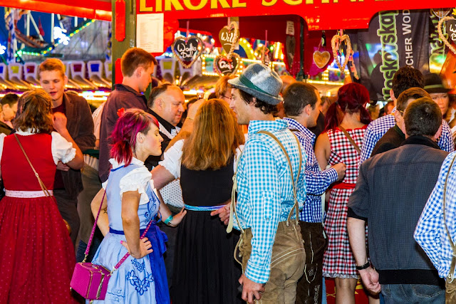
There is an additional element in using flash, it imparts a certain look to the images, a postcard aesthetic of bright strong colours.  It also has an immediacy, people in the foreground pop out of the image, again not a natural look, but a distinctly stylized one that works in this context.  The photo below illustrates this well.  The guy on the right got in really close and tried to put his hand over my flash gun for a joke.  He was too slow and became the photo.  He is blurred, this is unavoidable,  I still must expose for the background. I am only using the flash to add colour to the foreground, I am not using it as a prime source of light.  This is a 1/30s exposure.  
  

Another example below, although here I have got the mid field exposure wrong.  I set the camera to manual and exposed for the sky to avoid it blowing out and then hoped the flash would fill the foreground.  It did not quite work, but I am still pleased with the look of this photograph and the contrast between the girls on the right and the couple on the left.  I know who is having the most fun.


As night really falls this technique gets progressively harder.  Here the exposure is 1/10s at f/5.6 and ISO 800.  The flash has frozen the foreground action whilst the background blurs a little.  Just after I took this the girl slapped the guy, they were not happy bunnies!


10 minutes later and I am at 1/8s, f/5.6 and now ISO 1600.  Not very sharp this one, but still OK, the girls in their heals eating next to a pile of garbage, Parr territory (I hope).


The flash is working for me, although it is making me far more conspicuous, more than I am comfortable with, but I guess I just have to cope with this.  I also found that for about 30 minutes after sunset I can get great photographs, but beyond that it really is too dark to shoot unless very close to the lighting.  The good thing is that sunset comes at 7pm at the moment, a time when people are genuinely drunk and potential is everywhere.

This is beginning to come together, I am getting shots that will work with the concept I am formulating.  On Sunday evening or Monday I plan to take stock and pull together a sample set of 12 and see where any gaps exist or where I might improve.  The fest still has a week to go and I am off work Wednesday-Friday next week.  That said I will need to become prescriptive about what I want to achieve as it will be another year before this comes around again.  Although, the Hofbrauhaus in downtown looks like the fest most days so I could cheat and grab a shot or two there if I am really missing something.

Friday, September 28, 2012

"Tulsa" - by Larry Clark


If there is one area in which I am failing on this course it is clearly a lack of consideration of other photographers work.  This is my 41st post in my Social Documentary Blog and yet only the 2nd that actually addresses the subject of other photographers.  I think there are a couple of reasons for this, the main one simply being time, not only do I have precious little of it, but looking at a writing about photography is very time consuming.  This is rather sad because one of the aspects of studying photography has been a realization that I love the medium and get a real thrill out of seeing original work by the greats of the medium.  I am an avid collector of photobooks, a week never goes by without something arriving from Amazon.  My goal has always been to consider one artist each week and write about my feelings about their work, it is just not happening - so here goes!

Larry Clark's Tulsa is not an easy book to look at.  I first came across images from the book in the recent exhibit of American photography at the modern art museum in Munich.  The exhibit was largely reminiscent of photographs featured in the New Topology exhibit of the early 70's, however, with the inclusion of additional artists such as Eggleston, Winogrand, Friedlander and in particular Larry Clark.  Clark was represented by a short row of 8x10 photographs, original prints taken from Tulsa.  These were hung on their own against a vast white wall.  There was a visible shock reaction as people studied these images.  They were very different from the other material in the exhibit, primarily different plays on the landscape; these presented a visceral study of a descent into hell.  Two photographs reached out and attacked the viewer, a pregnant woman shooting drugs, adjacent to an open coffin containing a newly born.  This neatly summarized Tulsa, fascinating voyeuristic photographs possessing a terrifying narrative.

In a sense it is in a similar vein to Nan Goldin's work, an intensely involved study of a severely dysfunctional group of people, however, where Nan clearly loves many of the subjects of  her narrative this cannot be said of Larry Clark. In his photographs teenagers mix guns with speed and sex, the outcome inevitable.  The images are starkly black and white, there could be no colour here, the world he portrays is black and white, life and death, heaven and hell.  He is involved, after all he is there, but the photos are not made with love of the subject, he simply seems to be chronicling them, the edit intended to shock rather than invoke empathy.

This is, however, Social Documentary at its best, the images expose late 60's small town teenage culture, kids driven by boredom into the excitement of living on the edge, and then falling off.  It is not a study of "The Other", Clark is part of this, he was one of the speed freaks, injecting drugs as he took these photographs.  When Robert Frank made The Americans in the late 50's he was exposing the American dream for what it was, Clark turns that dream into a nightmare.

Assignment 2: Into the Night

The night completely transforms the Oktoberfest, the colours become more vibrant, the crowd much noisier, and the challenge of taking effective photographs becomes far more acute.  With this assignment I am doing something I have not done so far in my OCA studies, I using a camera mounted Speedlite. Thus far, I have almost been purist in my desire to work with available light, however, the fest presents new problems that can only realistically be solved using a flash gun.  During the day there is significant shadow created by the tents and other buildings, plus the possibility of strong low lying sunlight - a flash can help to lift the lighting of such scenes and add a little extra colour to the foreground people.

At night yet another problem arises, the fest is brilliantly lit, it consumes up to 14% of the city of Munich's electricity supply (a city of over 1.3 million people).  Any photograph that I take will be back lit by the fairground and illumination of the beer tents.  Once again the solution is camera mounted flash.  The night also brings exposure challenges, especially as I am walking around doing what is essentially street photography, good opportunities of people interacting form and dissolve in seconds.  I do not have much time to fiddle with exposure.  I also need enough shutter speed to freeze the action somewhat.  This is a constant balancing act, adjusting ISO, switching from aperture priority to speed priority, always thinking about the scene.  I am taking advantage of the fact that I am shooting digital RAW, I have 1 or 2 stops of adjustment in my pocket, although I would prefer not to use them.

As already mentioned the night changes the fest, it increases the tempo and I feel a palpable sense of excitement walking through the milling crowds.  As I pass the tents I can hear the roaring of thousands of drinkers singing away to the band - singing is a big part of the experience and really great fun.  There is also the real dark side, night also falls as the first really drunk people start to stagger out of the tents not all making their way home. Aggression starts to flare a little, typically late teens posturing and shouting, but sometimes it gets nasty.  This is where I start to get quite uncomfortable, I have seen plenty of violence at the fest, a person glassed to the ground with one of the huge beer mugs, blood everywhere, but generally I was also pretty drunk at the time and immune to the threat.  I want to capture some of this with my camera, but photographing someone already angry and fighting, hmmm, need to think about that a little.

However, I need to avoid overplaying this element, given how many people go and get drunk there is amazingly little trouble and the security guards are well experienced in dealing with drunken idiots.

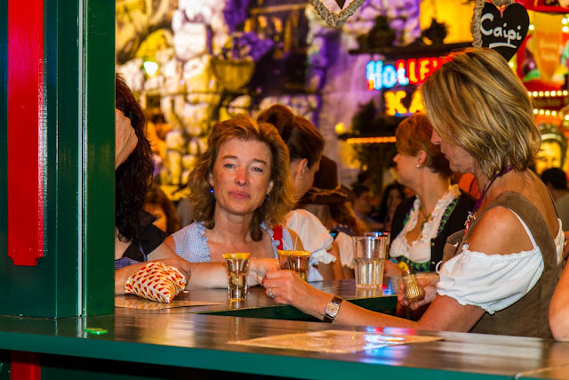
A couple of days ago I spent no more than 40 minutes at the fest and shot 60 frames.  My interest that evening was in the fair ground and the stalls that surround the event.  My first shot, however, was this rather lovely lady enjoying a few additional drinks, she smiled so broadly after I took the shot, nice:


I am thinking of doing a series of images on the booths, they are simply a riot of colour.  Clearly I need more in the image for it to work for the assignment, but here are a couple of the more interesting ones.


Another aspect of the fest is the immense fairground and the rides:


The above shot is an experiment and one that worked for me but again is not for the assignment.  The next one is a little more appropriate.  I wanted to capture groups of people interacting on the rides themselves.  I am happy for their to be movement and blur, but it needs to be managed to the degree that we still see the people and their joy or terror.  It also will only work at night or dusk as I need the contrast for that.


My second subject of the evening was a look at the darker side of the event, for which I took a trip around the back of the tents where it is a little less well organized.  The first shot was this, it works for me:


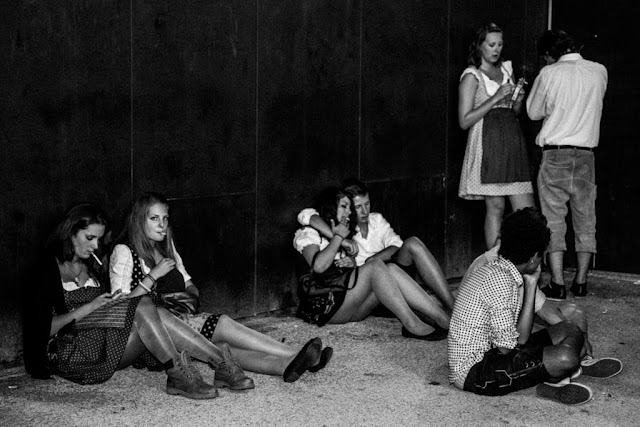
The next shot is back in the fairground, but illustrates an element of what I need for the set, the end of the evening, fatigue or drunkenness sets in.  There is a bit of the Martin Parr about this one, vibrant colour, teenagers being teenagers.


Next are three shots in which I start to bend the rules a little.  At the start of my studies with the OCA a very clear mantra was established, do not mix B&W with Colour in an assignment.  However, as I advance I now know that rules are made to be broken, but carefully and with intent.  One thought I have at the moment is to explore using colour to describe the joy and excitement, but B&W to convey the depths to which people sink.  It is not an easy decision and one I will not make until I have completed the shooting phase of the assignment.

B&W also has the advantage of working far better in more marginal light and also obscures some of the more distasteful elements.  As an example this "Bierleichen" (beer corpse), was wearing a white shirt stained yellow with his won vomit.  He is unconscious, but at least upright and so safer than lying down.  The number is roughly his age and the heart reminds us of the bright side of the fest.  If there were no constraints on subject matter this would be a strong photo, but the only people he is interacting with are his inner demons and in a few hours the wife his ring finger suggests is probably waiting for him at home.  I pity him at so many different levels.


My final two shots are more appropriate for this assignment, the interaction is there.  The first one conforms to my own preferred planar view on the world, broken by the man with his hand in his pocket overlooking the scene.  The second is just a bunch of people taking it easy after some serious fest going, tired but not out of it.


I feel that I have a developing narrative and it looks at present as if it will describe the stages that people go through at the fest, from the excitement of going to the despair of having gone too much.  It will not be a temporal narrative, night and day will intersperse and it will be broadly positive.  I love the fest, it really is a wonderful and uplifting event, 99.9% of people have a great time and OK there is the hangover, but no pain no gain.  However, a few will end badly and this needs to be captured as well.

After 4 photo shoots, in my mind I can see how the set will develop, but it is not really possible to write this down as a plan beyond what has been said here.  Each visit is opportunistic,this is not landscape.  I could do this as landscape and then I could plan each shot, the lighting I want, the number of people at the event, and so on.  This is Social Documentary, opportunities come and go, at any given time the perfect image always exists, I just might not be there to capture it.  I have the day off today, so will be able to spend some quality time with my drunken subjects and then have the weekend to explore further.

Final comment, this is really great fun to photograph, it works best when I try not to think about it too much!

Thursday, September 27, 2012

"The Ongoing Moment" by Geoff Dyer


A learning outcome from the Leeds weekend was the development of an interest in the psychology of photography, with a realization that I know sod all about the subject.  Over the weekend both Freud and Jung were referenced but without me being able to appreciate the comments. This combines with a growing need to deepen my understanding of how people look at photographs and how elements within a photograph influence the reading of the text of the image. In my early naivety about image making I thought it was all about the intent of the photographer, that this established the meaning of the photograph.  Both through further reading, but also the personal experience of looking at photographs, I realize that this is only a part of the story.  But to what degree does the context in which the photograph is viewed and by whom it is viewed affect the reading?  Photographs with their supposed connection to reality are often mistakenly seen to be carrying a literal and fixed meaning, a moment of history ossified  by the click of a button.  However, this is evidently not true, social documentary photographs of 1930's poverty shook people at the time and now often evoke a sense of nostalgia for simpler times.  However, what is this process of viewing and how does the mindset of the viewer change the experience.

To that  end I requested advice on a good introductory text that ideally addressed the psychology of photographs or even simply a good overview of the field.  The reply from Jose Navarro on the OCA student website was to read this volume, a good recommendation, but one that answered a different but related question.  I was looking to understand the psychology of the consumer, whereas this book firmly addresses the psychology of the producer. Dyer weaves a narrative through the 20th century history of predominantly American photographers and how they influenced each other.  He does this by reference to certain key themes in photographs, often mundane yet powerfully linking.  These include blind beggars, hats, gas stations, doorways, even broken down park benches.  He explains how these metaphors for societal change have fascinated photographers and created strings of images that feed upon one another, visually linking a group of practitioners many of whom never met one another.  Interesting anecdotes pepper the text, particularly Alfred Stieglitz's sex life,  perhaps here is the link to Freud, much of the motivation seems to be sexually driven.
The book deals with why and how notable photographers created what they did and what motivated them to do it in the first place.  The focus on common themes and the way in which each photographer added their personal stamp to that subject addresses one of the problems I wrestle with as I progress, how to do something original.  I, and I think many other students, still fixate on subject matter, however, what the book illustrates is that style is more important in defining the output of one photographer versus another.  Subject is important and differentiates, say, a social documentarian from a landscape photographer, however, within a given domain it is the how and not the what that establishes a photographers signature.  Over time subjects remain remarkably fixed, we return to them again and again, but it is how we return to them that counts!

To conclude, the book does not really address my starting question, i.e. how the reading of photographs is influenced by the reader and how this reading has changed with the evolution of society.  What it does is to answer another question that has been in the back of my mind for some time, is a unique subject needed for unique photography?  Clearly the answer is no.  Indeed there may be immense value in looking for subject matter in the canon of photography, but working in my own style.  Just need to develop that style!

Tuesday, September 25, 2012

P11: crowds

In my experience shooting at the Oktoberfest so far, the hardest task is being able to isolate people from the immense crowds that thronged the Wiesn over the weekend.  However, with Project 11 the teeming masses come to my assistance and provide an ideal source to practice the art of photographing crowds.

I find framing such large numbers of people in a meaningful way very challenging, what is the goal of the photograph, just lots of people is not really enough, there needs to be more, whether it is a statement of documentary or art.  Other questions such as how close, what angle, symmetry versus asymmetry need to be asked and answered.  I expect to come back to this topic photographically as I build my Oktoberfest portfolio, but here is a start.

In my first image I have isolated a group of people within the crowded beer garden areas.  The table and chairs help to structure the picture and force the people into a convenient cluster.  A relatively large aperture on a gloomy rainy day serves to separate the front row from the mass behind them.


More difficult is a shot taken from within the people walking through the Wiesn.  The following shows the challenge, there is no real point of focus, it is just a mass of unrelated objects.


Kneeling down to take a shot starts to solve this problem a little by placing me more into the plane within which the people are standing or walking.  in the following shot there is a better connection with the fest goers created by the lower angle shot.  What this loses, however, is the presence of the larger crowd behind the girls, my angle of view only includes the foreground.


Escaping from the high density crowded areas I took this on the following day on the grassy slope that lies to the West of the Wiesn.  Here the crowd has dispersed onto the grass and it is easier to read the photograph, making out different groups of people.  Badly underexposed due to the huge white reflective tent at the back, this is an example of a shot that I would like to include in my assignment 2 submission.


Once more back into the crowd, another approach is to shoot along the plain of peoples heads and include the sky.  This compresses the crowd into a sea of heads but permits room to breath in the photo.  personally I do not like this approach, it lacks any purpose.


As the text suggests one way to manage a photo of a crowd is to find a high viewpoint and look down.  This is the exit from the Underground train into the Wiesn, not for the claustrophobic. Now the photo starts to gain some depth and the suggestion of the never ending crowd starts to evolve.


Back on the hill to the West of the Wiesn,  and now using a long telephoto, 300mm on a 1.6x crop sensor, so the equivalent of nearly 500mm, we get the compression of people into a mass.


However, widening out, really provides the impact of the crowd.  In the next 3 shots I progressively zoom into the scene, with each photo cropping more of the sky and surroundings until all that is left is a sea of people.  Most photographers are happy with the first shot, for me it is the final shot that has the most impact. By removing reference to sky or boundaries the people seem never ending.  Also without other points of interest the eye flits from person to person seeking recognition, but finding none.


Monday, September 24, 2012

Assignment 2: The first Weekend

The Oktoberfest is now in full flow, starting with the full pomp and ceremony Bavaria is associated with.  All the usual stereotypes were present, oompah bands, leather shorts, huge glasses of beer.  I shot the preparation for the opening parade and then headed to the Wiesn (local name for the fest site) Saturday and Sunday afternoons.  My current plan is to go as often as possible, but not each time spend no more than an hour or two shooting.  This should give me around 20 hours with my subject during the next two weeks, long enough to build a set of images for the assignment.  

I am shooting the fest with my 7D, the odd sheep in my camera family, a rather rash purchase that did not get anywhere near the usage I planned.  I do shoot with crop sensor Canons, but those are the 40Ds I use underwater.  Otherwise I shoot my 5D2 when using a DSLR.  Most recently I have switched to much smaller cameras that can be used unobtrusively in the street.  So why a DSLR now and why the 7D?  First of all the fest is a very much in your face experience, people generally don't care whether you take a picture or not, so a DLSR is fine.  I almost only ever use prime lenses with my smaller mirrorless Samsung system, the zooms are not good optics and very slow.  For the crop sensor Canon I have a 17-55mm f/2.8, permitting rapid response to different scenarios and delivering good quality images.  The 7D is also weather sealed which is valuable not just in case of rain, but also beer.  Finally and with the latter comment in mind, people at the fest get drunk, very drunk.  I need a robust camera, but also one that I can afford to lose if things get really rough.  I do not expect trouble, but I have seen it before and who knows.

This is not, however, about technology.  It is about imagery and documenting a great event through the people who attend.  My goal is to use the fest goers as the background for a study of people relating or interacting with each other.  I have in mind a kind of Rake's Progress, beginning with the joy and fun of the fest, but touching on the human impact of so much drinking.  On the opening Saturday 3 years ago, 790 people needed medical treatment as a result of drinking too much.  There is a German term for what happens when people get caught up in the fun and forget that the beer averages 6% ABV - Bierleichen (Beer Corpses).  I do, however, want to make this a study of the joy of the fest so need to be careful not to dwell too much on the darker side.  After all 6 people we know met each other at the fest and are now married.

I am quite pleased with the start I made, some good photographs that might work, others that are fun but fail to meet the brief.  In fact it is very difficult to not get carried away with the colour and ever changing forms that present to the eye.  I am also now fully committed to colour for this set, especially after the shots I got this weekend and these during the day.  At night it becomes far more vibrant and mad.  I plan to go back a couple of evenings this week around dusk and at least once I need to be there when the tents empty out at the end, it can be quite a sight to see 10's of thousands of severely drunken people trying to remember where they live. 

So where I am I right now.  I started with the preparation for the fest, nice shots, but not really where I am going with this, they are too posed and the interaction is not really there.


However, once at the fest things got better.  This is not a great shot, but it is one of a type that I want to get, young guys having a great drunken day out, roaring and shouting, acting like idiots.


The next shot might make my final cut.  These 5 ladies are clearly waiting for something and the avoidance of eye contact is quite amazing.  The interaction is plainly visible, but it is in a sense a deliberate non-interaction.


Smoking, the ongoing bane of Germany, so healthy in so many ways, this is the German blind spot.


There is also always a good chance for the me shooting you shooting them shot, although in this case a German TV camera crew, the fest has its own TV channel.  Lot's of interviews with the good of the city and very drunk people.


Not everyone does the traditional thing, I liked the colour and attitude of these guys.


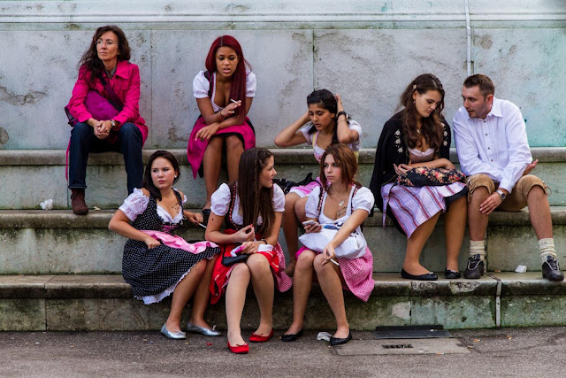
Now a couple of shots of people taking a break between beers, first the guys and then the girls.   Pink seems to be this year colour, there always is a colour trend for the Dirndls worn by the younger girls.


This is shot I want to develop.  If possible it is interesting to reference art in my own photographs, this area could develop into a sort of play on Cartier-Bressons famous photograph of the people easting on a sloping river bank.  The second shot then contains the river of humanity.  The interaction element is not so clear, but I might bend the rules a little to add context to the set.


People, 100's of thousands of people, attend the fest every day.  The average is about 500,000 per day, Sunday probably beat that, I have never seen so many people in one place before.  This again is a riff on modern art, almost Jackson Pollock in the spray of colour, but maybe more "Where's Walso"


These girls just had to be photographed, so miserable...


And as I mentioned at the start there is a down side to the drinking, these guys were pretty busy during the day.  There are special facilities to handle the very drunk, they really take good care of people and ensure that they are safe until sober enough to leave.  A tent exists with beds and nursing care for those who cannot make it home.  When I think of the UK and the attitude to alcohol there, this is much more pragamatic.  People drink, at a beer festival they drink too much, some will get very ill, so plan for it and ensure that they survive the experience.


Saturday, September 22, 2012

Preparing Landscape for Assessment

Finally, I managed to package my Landscape course up and send it in for assessment, a year of work wrapped up in brown paper.  Just hoping it got safely to where I sent it!

I am blogging this as I want to document how I pulled the material together as an aide-memoir for this course and because preparing for assessment is now a key stage in the newer courses. So what did I do?

  1. First of all I printed all of the photographs at A3 with a minimum of a 2cm white border.  I organized the images on the paper slightly higher than the center of gravity.
  2. For Assignment 1 and the Portfolio I printed on Ilford Smooth Pearl which suited the rich and varied colours I was working with.  For the other assignments I used Epson Heavyweight Matte, excellent for deepening the blacks in the B&W Assignment 2 and for softening the Autumn colours in Assignment 3.  Assignment 5 was a toss-up and I went for the matte in the end.
  3. Most of the prints I created as I went along with the course.
  4. I also included the original photographs as submitted to my tutor plus any modifications or substitutions to show how I responded to the input.
  5. For each set of photographs I then printed a "contact sheet".  In effect I created an A3 PPT slide with a table that contained the names of the photographs and a thumbnail for each.  I feel that this will enable the assessor to see the whole set together before then moving through the individual photographs.  I hope this will add an overall context to each assignment.
  6. I printed my essay and then ring bound it using a small binding machine that I have.  I backed the essay with a sheet of black card and used a clear sheet of plastic as a cover
  7. I did the same with my assignment notes, tutor reports, and my responses.  This means that the assessors will have a booklet containing all of the relevant assignment documentation in one place.
  8. All of this went into a Silverprint portfolio box.  
My goal is simple, to make it quicker and easier for the assessors to understand my work and hopefully give them more time to assess the photographs.  I guess they go through a great many similar boxes of prints on the assessment day, anything I can do to make my work more accessible cannot hurt.


Assignment 1: Feedback & Corrections

Another assignment that I was quite concerned about seems to have gone down better that I expected.  My tutor bought into the idea of using myself as a subject and on the whole achieved the statement I was trying to make.  The key criticism is that it is hard to see the passage of a day in the photographs, which whilst  I partly partly, is in a sense the inevitable outcome of a day in my life.  At the time my 12 hour working days simply stretched from morning to evening, with the long summer days and inner city setting ensuring that the light barely changed during the day.

A key topic he addressed was my decision on B&W rather than colour and made a very strong point that it is a decision that needs to be driven as much by the subject matter as the artistic desire.  A key statement is
"Having decided what you want to say something: how best to say it so that it communicates and or comments on something that you feel is important and want to draw attention to in a way that will best be understood by the viewer."
For this assignment I really felt that B&W captured my sense of being oppressed by my work and the darkness that I felt inside.

The key critique was that the light levels barely changed during the day meaning that the set did not convey a sense of the passage of time.  The problem I have is that the windows in the rooms I use during the day face to the East and are fronted by a white building which reflects the afternoon sun.  Combined with the fact that I was shooting just 2 or 3 weeks after midsummer and that we were enjoying 30 degree cloudless days, meant that the daylight barely changed.  I do take the point, though, this meant that the narrative element of watching a day pass was missing without the accompanying text.  Again, a big part of what I was trying to convey was monotony, but in an interesting way - oxymoron alert.

The time lapse video worked much better in this context and went down very well.  The film created that sense of the passage of time and the imprisonment in my home office.  This is a key learning for me as the production of photofilms greatly interests me as way of conveying a "book" of photographs in a coherent and yet compact fashion.  Nan Goldin's book, "The Ballad of Sexual Dependency" is based upon a slide show set to music and I am sure is far more powerful viewed that way.  This can be overdone and I am cautious about how I approach the topic, but I have obtained a good quality hand held sound recorder and plan to add ambient sound to the next photofilm.  I need to drop this down onto a DVD for inclusion in my submission set.

Turning to the individual photographs, the shower shot was called out as the best, and the one of my back the worst, no real surprise there.  I will remove the shot of my back from the set.  I have thought about how to replace it, but cannot find a way that adds to the set.  I have other activities of my "day", many outside the house, but whilst these offer more information about Shaun, they reduce the sense of imprisonment, two examples:

 End of the day, relaxing, reading something on my iPad.  Some days this really was the case, but rarely.

Or middle of the day, just getting some air ti recycle some of the cardboard that I accumulate from Amazon

Another thought was to expand on the imagery from the video and use a photograph that provides more context to the room in which I work:

However, given that I already plan to include the video this shot really adds very little, other than that I am sitting at the fun computer that I do my OCA work on, rather than the work laptop.

A few photographs came with suggestions for processing tweaks with example done in Silver Efex.  I have Silver Efex, but so far had not really gotten to grips with it.  Boy, was I surprised, what a powerful tool for making changes to an image.  The ability to change specific area of the photo with such ease is very powerful and much better than using the mask technology in Lightroom.  I need to spend some more time with this package, especially the colour processing.  The only thing I do not like is that it is cumbersome, creating a separate Tiff on which the edits are completed.

He recommended adjustments to three of the photographs, essentially lifting the brightness in places.


Here I have lightened my face and darkened the foreground, but only very subtly.  I have also used the noise reduction as this was a very noisy image


The main change here is an increase in the contrast on the cutlery in the background.  Not terribly noticeable at this scale, but clear in the prints.


 I have brightened the camera to make it more prominent - again a very subtle adjustment

With these changes I am now comfortable with the set of seven images that I have.  This is unusual for me, I have always gone for the maximum number of photographs, however, in this case 7 works for the subject, perhaps that is a sign of a maturing attitude to telling the story.

I have now printed my photos at A4 size on Ilford Gold Fibre Silk.  This is the first time I have used this semi-gloss paper, and I can say that I am extremely impressed, the sense of them being an inkjet print is gone, the images have all the quality of traditional photographic prints, even the chemical smell of the paper as the ink dried.  I plan to stick with A4 for this course, I believe it will work better for the subject matter I am developing and in particular the book concept for Assignment 4.

A good start to what is again turning out to be a more enjoyable and thought provoking course than I expected it to be at the outset.