
A key topic he addressed was my decision on B&W rather than colour and made a very strong point that it is a decision that needs to be driven as much by the subject matter as the artistic desire. A key statement is
"Having decided what you want to say something: how best to say it so that it communicates and or comments on something that you feel is important and want to draw attention to in a way that will best be understood by the viewer."For this assignment I really felt that B&W captured my sense of being oppressed by my work and the darkness that I felt inside.
The key critique was that the light levels barely changed during the day meaning that the set did not convey a sense of the passage of time. The problem I have is that the windows in the rooms I use during the day face to the East and are fronted by a white building which reflects the afternoon sun. Combined with the fact that I was shooting just 2 or 3 weeks after midsummer and that we were enjoying 30 degree cloudless days, meant that the daylight barely changed. I do take the point, though, this meant that the narrative element of watching a day pass was missing without the accompanying text. Again, a big part of what I was trying to convey was monotony, but in an interesting way - oxymoron alert.
The time lapse video worked much better in this context and went down very well. The film created that sense of the passage of time and the imprisonment in my home office. This is a key learning for me as the production of photofilms greatly interests me as way of conveying a "book" of photographs in a coherent and yet compact fashion. Nan Goldin's book, "The Ballad of Sexual Dependency" is based upon a slide show set to music and I am sure is far more powerful viewed that way. This can be overdone and I am cautious about how I approach the topic, but I have obtained a good quality hand held sound recorder and plan to add ambient sound to the next photofilm. I need to drop this down onto a DVD for inclusion in my submission set.
Turning to the individual photographs, the shower shot was called out as the best, and the one of my back the worst, no real surprise there. I will remove the shot of my back from the set. I have thought about how to replace it, but cannot find a way that adds to the set. I have other activities of my "day", many outside the house, but whilst these offer more information about Shaun, they reduce the sense of imprisonment, two examples:


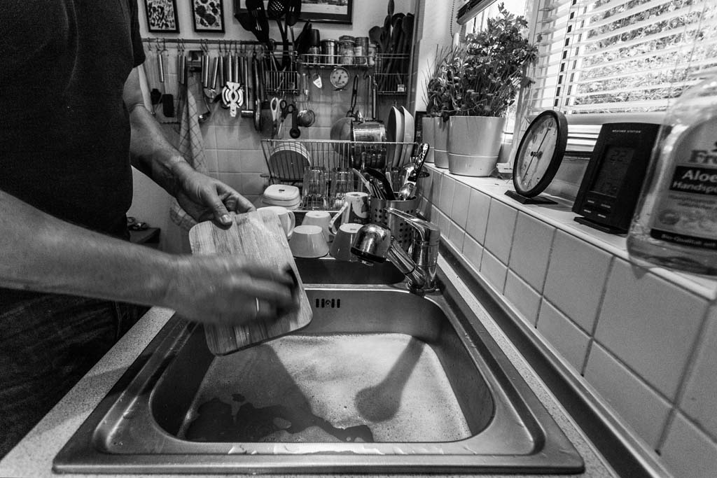
Another thought was to expand on the imagery from the video and use a photograph that provides more context to the room in which I work:

A few photographs came with suggestions for processing tweaks with example done in Silver Efex. I have Silver Efex, but so far had not really gotten to grips with it. Boy, was I surprised, what a powerful tool for making changes to an image. The ability to change specific area of the photo with such ease is very powerful and much better than using the mask technology in Lightroom. I need to spend some more time with this package, especially the colour processing. The only thing I do not like is that it is cumbersome, creating a separate Tiff on which the edits are completed.
He recommended adjustments to three of the photographs, essentially lifting the brightness in places.


With these changes I am now comfortable with the set of seven images that I have. This is unusual for me, I have always gone for the maximum number of photographs, however, in this case 7 works for the subject, perhaps that is a sign of a maturing attitude to telling the story.
I have now printed my photos at A4 size on Ilford Gold Fibre Silk. This is the first time I have used this semi-gloss paper, and I can say that I am extremely impressed, the sense of them being an inkjet print is gone, the images have all the quality of traditional photographic prints, even the chemical smell of the paper as the ink dried. I plan to stick with A4 for this course, I believe it will work better for the subject matter I am developing and in particular the book concept for Assignment 4.
A good start to what is again turning out to be a more enjoyable and thought provoking course than I expected it to be at the outset.
No comments:
Post a Comment