Tuesday, October 30, 2012

P14: people at work

People working make ideal subjects for documentary photography as they have a purpose, they are almost always active and frequently that activity is visually interesting.  Working people also dress for their role, frequently in clothes that reflect the region as well as the task.  During my work at the Oktoberfest I was very conscious of trying to include the army of people who cook the food, serve the beer, and even keep the peace.  Many of these photographs made it into my final edit for the book "Fest", so in a sense this post is a retrospective look at some of the photos and what I found particularly interesting about them.

I start with this study in pink, a the three people working at the ice cream bar having a chat after serving a customer.  This photograph continually tricks my eye into believing they are standing behind a screen, when in fact the screen is the aprons they are wearing.  I also like the sense that someone is out of shot waiting for delivery of the second ice cream carried by the lady with the dirndl.


This shot did not make it into the book, but is still one I like very much as it catches the staff of one of the multitude of booths around the Wiesn catching a break and having a bit of a laugh   I would have liked to be closer and make the workers a more obvious subject, however, part of the original goal for this shot was to capture the sign with all the different Schuss (shots) that could be added to the coffee, just in case for any reason a customer still needs more alcohol.


The hardest workers of all are the waiters and waitresses inside the tents.  Not only do they have to carry up to 10 2kg glasses full of beer they have to do it in within a raucous crowd of drunkenly unsteady people.  When someone yells "Vorsicht" very loudly immediately behind you it is a waiter on their way with more beer and it is time to move quickly.  They make good money, payment is on a piece work basis, they earn 10 percent of whatever they sell plus any tips.  2 weeks at the fest can be the equivalent of a couple months elsewhere. These jobs are jealously guarded and can be handed down through the generations.


Also hard at work are the men serving beer.  They are usually men as the beer is gravity served from wooden barrels that require immense strength to move when full. When a new barrel arrives a spile is driven in by a wooden mallet.  Although the Oktoberfest is a highly slick operation it still follows time honored traditions.


A quiet spot before the mad rushthat will inevitably come.  A waitress is taking a break, but the ever vigilant security guard has his eyes peeled.  They are nicknamed black sherifs as they always dress in black, and used to have a reputation for casual brutality.  I think things are better now, but 20 years ago when I first started going to the fest, you did not mess with these guys.


It never fails to amaze me how trays full of food manage to be safely carried through the throng of people.  I guess there must be some accidents, but none that I have seen.


I was also very conscious of wanting to capture the other group of people at the fest, the police and other emrgency services.  In this case these two cops were shaking this guy down, no idea what for and was not going to hang around for them to see me.  Generally I have found the Munich police to be pretty clam about being photographed, although normally I ask permission.


This is a job I do not envy.  The red cross supplies volunteers who take care of the more drunken people at the fest.  I suspect they are a little more than the St John's Ambulance Brigade back home.  They have stretchers on wheels with a cover to protect the victim on the way back to the on site hospital.  Although much of the work is dealing with the dangerously drunk, there are a lot of leg and arm injuries from people falling whilst dancing on the benches in the tents.  We all do it, we all get drunk, we all fall over, some don't get up again.


Did I mention not messing with security, well:


My last two images of people working are of workers not working.  In the first a cook has a crafty fag early in the morning ebfore the event really gets going.  In the second the ubiquitous need to send a text message at every possible moment.  The other side of the stand was very busy...


A slightly different take on what the project possibly had in mind.  I am still far more interested in using this course to develop the skills needed to engage in street photography, than spending time doing arranged photo sessions with people I know.  I have experience of that type of photography, this more candid work is where I want to be at present.

Monday, October 29, 2012

Assignment 2: Finalizing the Book

There has been a risk that this book design project could take over from my progress in Social Documentary, it has been my current obsession.  This weekend I decided that it was time to bring the project to its conclusion and commit to the final incarnation of the book.  I had all the tools I needed, 2 earlier attempts available in print, helpful critique from fellow students and an extra day off to do the work.

Although there are a great many steps and challenges in making a book there are two fundamental problems that must be solved.  Narrative and Design.  Of these narrative is the dominant question, design informs and supports the story telling but it cannot alone carry the reader.  I am sure it is possible to create a well designed book that has no narrative, but I would be lost as to what the point would be.  Poor design, however, will get in the way of the narrative, the reader will spend more time trying to understand the structure and potentially being irritated to the extent that they abandon the attempt to understand the work.

Whilst working on the final version I went through a few variations in design as the sequencing of the photos and hence the narrative started to coalesce towards a final form.  In effect design and narrative were interacting in my mind and so it is difficult to talk about one without the other.  However, in the interests of clarity I have separated them out for the purposes of this monologue.

Design

Design starts by understanding constraints and understanding what can and can not be done.  The first constraint comes from my on-demand publisher, Blurb.  To manage costs and create a conveniently packaged book I elected to use their "Standard" landscape format, which is neither standard not landscape, unless you live in the USA.  The pages are 8x10 inches, which once trimmed and allowing for the gutter means a 9x8 inch area that is usable in the book.  In other words the image space is almost a square.  I would much prefer an A4 or wider aspect ratio enabling me to fully utilize the image I see in the viewfinder when I make the photograph.  The only real alternative is actually square at 7x7 or 12x12 or what they call large landscape 13x11.  The bottom line is that if you want to avoid excessive amounts of white space on the pages it is important when shooting to think square.  I do wonder if the standards I see here are driven by an historic use of medium format (6x6, 6x7) or large format (5x4, 8x10) cameras.  

I did look at alternates, but all had the drawback of being significantly more expensive and not having the ability to share the books online, create ebooks for the iPad and download a high quality PDF of the book.  The former is essentially for the collaborative nature of the project and the latter to have something that I can share easily with my tutor.

Given the constraints, I then had to design several page options.  I started with the cover.  This work is not going to be sold in a bookstore, it does not need a cover that pulls the customer in and makes them want to look inside hopefully then to make a purchase.  But, I still wanted the cover to have impact and to convey a sense of what the book contained.  I have retained the cover design from the first book as this worked very well.  The full bleed images of the crowd reinforces the vast number of people attending, there is no end to the crowd.  This image had to be built in Photoshop to enable me to exceed the limited text sizes Blurb can handle.  The back cover image was chosen to illustrate the energy of the event and the almost surreal combinations of people attending.  I have chosen Gill Sans MT as my font, an elegant sanserif that provides a modern feel.


Inside the book I opted to retain a chapter structure and used the below style to open each chapter, a simple full bleed image fronted by a white page.


Within each chapter I opted for 2 different two-page spreads.  One valid criticism of the earlier book was that the full bleed images merged into one another and created visual confusion.  To avoid this I have surrounded each photograph with white space.  I wanted to use as much of the books available image space, filling the pages provided a greater sense of the chaos of the fest.  However, some images could only work in their original aspect ratio so a page structure was also needed for these.  In one incarnation I mixed the two page types together.  I found that the book worked better with each pair of pages being symmetrical.  The other design issue was then to ensure that each pair of images visually balanced and either complemented each other or provided a clear contrast.  The examples below illustrate that.  The first is more to do with the colour pink, the second is a contrast of two very different and yet colourful groups of people waiting for the event to start.


To add some extra impact I also included a small number (five) of two page spreads that I used to terminate a few of the chapters.  This allowed me to better convey the sheer size of the fest and the mad mixture of colours, but also to mix up the visual style a little.


With the book size decided and the page design complete a few other more minor details needed to be decided.  I elected to limit the book to 80 pages, this sits on a price break, but also provides a manageable volume to look at.  I was flexible on this, but 80 worked well.  I went for an image wrap cover in which the cover photographs are pasted to the end boards.  I find this works better for photobooks than a dust cover, but it is a personal choice.  For weddings I always use a dust cover.  Paper choice was easy, Matte, but not the proline Matte. I have used that before, but it is very much more expensive and I don't think it is that much better.  I added white end pages as I think these simply look professional. So that was the design, what about the contents?

Narrative

The first two books helped immensely in deciding the narrative flow for the book.  They allowed me to experiment with two basic ideas and then see what they looked like on paper.  The first book used a "Wakes Progress" approach, portraying the progressive descent from the traditional start  through the fun of the fair, to the drinking, then finally finishing with the grim reality of vomit and unconsciousness.  This may well still be my approach for the 12 image assignment, but it was too bleak for the book and had the issues of ending on a low point and being over-moralizing.  Coming from someone who drank 6 liters of beer on the last Friday of the fest and spent the next 2 days deeply regretting it, this would be rich indeed.  

In the second book I elected for a temporal narrative following the fest through the day.  This had the advantage of being far less judgmental and being able to finish at a more positive place.  It worked much better and is the basis for the final version.  In a sense I am presenting "A day in the Life of" the Oktoberfest.  In reality this is many days and certain photographs would sit outside the temporal flow.  

The next question was what photographs to include.  The first book used 107, the second 39, this one would sit somewhere in the middle.  This is where having the books already to hand really helped.  I went through each and using post-it notes colour coded the pages.  Red signified a definite, yellow a possible.  Once I completed the manual selection I then grouped those photographs in Lightroom and did some last processing  to ensure visual consistency.  I did not crop the images at this stage, it is easier to crop inside the book making software as the photos drop into the image containers.  That allows me to see two photos adjacent to one another and make editing decisions to bring balance or contrast.  At this stage I also pulled in photos as yet not used, the new page designs offered a little more flexibility than I had before.


I started the narrative with 3 photographs that served as a reminder of the tradition that underlies the Fest, but at the same time not wanting to overdo this aspect.

I stepped through the early morning arrivals and the people waiting for the event to start.  I incldued chapters that portrayed the day time experience of the fest and a rather gloomy one that showed that it was far less fun in the pouring rain.  A key element for my personal vision of the fest was to show that it was bloody good fun and had its funny side, but to also keep an eye to the fact that there are dangers in drinking so much.  The following two spreads illustrate this:


In the first book I had too many shots of the consequences of drink, they were too dark and dismal.  For this volume I brought in an as yet not used image that sums it up with a degree of humour.  It almost looks as if they are trying to spell something out.  The two page spread rescued this letter box image and gave it a new currency.


At the same time, there are problems at the fest and one that sadly it is getting worse year by year.  Violence is an occasional problem, actually surprisingly rare given the nature of the event.  Of greater concern was the increase this year in the number of people needing medical treatment due to alcohol poisoning. The good thing is that the red cross and paramedics know what they are about and do a great job with their covered stretchers on wheels.


This needed to be said, but not over stated.  On the whole I wanted imagery that captured the colour and the madness of the event.

I also elected to include the people who keep it all going, it is brutally hard work and in particular those who serve beer in the tents are a hardy bunch of people.


I finished the book as I did in book 1 with an early morning shot of the Wiesn shuttered and completely empty of people.  With this I imply the start of the next day, but also an end.


This ended being a very personal take on the fest.  I have tried to avoid the usual cliches that are found in the official views, but at the same time to capture the fun and vibrance of this crazy event.  It has its problems and after a few days all of us who live in the city wish it would go away.  However, there is every year a special feeling I get when I first walk onto the Theresienwiese and hear the roar of the tents in full voice and smell the grilling meat and beer.  It is a sense of excitement engendered by the expectation of fun and joyful expression.  Like the anticipation of Christmas, reality is something of a let down, but it is still a very special place and a unique experience.

I thoroughly enjoyed creating this volume, from planning, through photography and into design, it was a great learning experience and one that will help me as I transition towards my final year degree studies:

FEST

By Shaun Clarke

Friday, October 26, 2012

"After Photography" by Fred Ritchin


Looking at my blog you would think I barely read any books on photography, not the case, almost all the reading I do these days is on the subject of Photography, I just don't get around to writing about it as often as I should.  Partly laziness, partly a difficulty in summarizing and expressing my thoughts about what I read.  I have a tendency to read a lot of material rather superficially forming a progressively composite view of how I understand what I have read.

I am also blessed with little or no memory for details, hence my original choice of Mathematics and Physics from A-level through to Ph.D., very little to actually learn but a great deal to understand.  When I was 26 years old, if asked I would describe my profession as a Theoretical Physicist, I was employed by the then Science and Engineering Research Council (SERC) as a research fellow at Imperial College.  Theory was my meat and drink, I spent my days reading papers, developing ideas and then implementing them as mathematical arguments or computer simulations.  As time passed I realized the computing side was more my thing than Physics and I stepped away from my academic career into the commercial world of the computer industry.

I have regrets, very little I have done since has challenged or stimulated me as science once did.  On the other hand the change in career led me to Germany, to the love of my life, Heidi, and eventually to this study of photography.  The OCA has put back into my life the love of learning and the challenge of solving problems for the sake of it.

BUT, as a former theoretical scientist, I am finding photographic theory very difficult to read and to comprehend.  With Physics there is a complex language, but a logical flow of ideas from postulate to conclusion.  In art theory there is an awful lot of discussion, frequently in opaque language, without any hard conclusions.  Everything is an opinion and if built upon evidence, that evidence tends to be other opinions.  At no point is there a beginning or end.   This is not in of itself right or wrong, it is the practice in art theory, however, to the student schooled in the logic of mathematics it is very difficult to organize as a personal thought process.  My inability to process abstract ideas coupled with a very poor memory makes this an almost insurmountable problem.  Oddly I am very good at general knowledge quizzes  none of my neighbours will play Trivial Pursuits against me any more, I even beat them playing the German version, and I don't speak German.  They tried getting me drunk, I just got better at remembering odd bits of information.  Somewhere all of this is stored, it is my index system that seems to be broken.

Recently I ordered a few books on photographic theory and criticism, including the rather dry "Criticizing Photographs" by Terry Barrett and a couple of books by Roland Barthes and Robert Adams.  I am currently reading "Why People Photograph" by Adams having chickened out once more from tackling Barthes and really enjoying it, very refreshing and to the point, review to come soon.  Among that order was the book about which I am writing this blog entry.  Ritchins takes a philosophical look at the impact of digital technology on photography and how it is changing or might change the medium.  First off this is a very accessible and readable book, the ideas are well put with an appropriate level of discussion.  He asks many questions and provides if not an answer at least his won thoughts about what might happen.

It has prompted a good many thoughts for me about the medium I am studying and where I sit within that world.  The essential premise of the book is that digital photography is a completely new animal, almost without relation to what came before it, in a sense he suggests that in the 21st century digital is to analogue what photography was to painting in the 19th.  I am not so sure.  I think he is mixing digital distribution with digital photography.  Almost all of the points he makes are about how photographs are used rather than how they are created.  The use case he describes is equally true for modern analogue photography in which almost all images are scanned to digital prior to being printed.  Once in the digital domain an analogue photograph is no different to a digital one.

A digital sensor is different to an analogue one, physics versus chemistry, however, at the most basic level both do essentially the same thing, they each measure the numbers of photons striking a 2 dimensional point in space.  Each then translates that into a meaningful signal, whether that is a flow of electrons or the number of atoms shifted from one state to another, it is still a measurement of photonic energy per square millimeter   Analogue has the virtue or vice of being more random and that the response function of the "sensor" is non-linear, but this is not something that cannot be simulated in Digital to the extent that the unaware could not tell the difference.

Where I do agree with Ritchin is that once an image enters the digital domain from wherever it originates it is transformed into something other than a photograph.  The ability to embed further information into the photograph, the ability to link context to image, the ability to distribute almost without limit, all make digital a far more democratic medium than analogue.  Above all digital is highly accessible, everyone in the developed world and increasingly the developing one has a camera embedded in their phone with the ability to create and transmit images in a fashion that even 5 years ago could not be comprehended.  Controlling photographic record by governments or corporations is no longer practical.  Abu Graib and other recent occurrences such as the British soldiers who photographed themselves murdering a prisoner illustrate that even that most secret and controlled of government bodies, the military, is now transparent in their actions.

It also changes the very nature of what it is to be a photographer, the torrent of vernacular images created and uploaded every day to the social web questions the value of the news photographer, a search engine can probably do a better job of recording events than sending a single person with a camera.  Ritchin points out that most so called news photography today is of pre-organized events created for photographers.  He illustrates this with two photographs of a group of US soldiers "invading" Grenada.  In the first shot  distributed as "news", soldiers are hitting the deck weapons ready hiding behind cover with a helicopter hovering in the background.  In the second, a different angle shows the same soldiers and a row of 10 or so photographers crouching in front of them capturing the "action" shot.

Where I started to lose a little faith with the book was when he started to use Physics to illustrate the difference between digital and analogue.  He used the change from Newtonian mechanics to both relativistic theory and quantum mechanics as a parallel.  I disagree on almost every level with this.  First of all Newtonian mechanics is still as valid and useful as it ever was, it is simply a macroscopic approximation that averages across micro and nano scale behaviours.  The introduction of relativistic theory did not invalidate newtonian physics it extended an existing theory.  It is also a bad comaprison with Digital as relativity is an analogue theory, it deals with time which has no quantum nature and gravity which does, but only at a scale we cannot yet effectively probe.  Time is non-linear as is space and both are affected by gravity, this is the general theory of relativity, however, neither have a digital analogue.  he is on safer ground with quantum mechanics, but again this theory did not invalidate what came before it extended it and fitted into a continuum of theoretical physics.  This makes the parallel to the idea that digital is fundamentally changing photography very weak in my view.  I don't disagree that digital is changing photography, however, keep physics out of it.  Analogue photography is no less a product of quantum mechanics than digital photography.

A really great book, with truly thought provoking ideas.  AND one that brought my first academic love into collision with my current one.  Even though I disagree with the parallel made thinking and writing about it was invigorating.  It might not help me to understand photographic theory, but it is a start.

Assignment 2: Book Design

I have either been very lucky or Blurb are in trouble.  Both books returned from the printer this week, within a week of my having ordered them, in both cases the forecast shipment was supposed to be 3 weeks.  Whatever the case, good news for me as it means that I can now begin the process of developing the third and final iteration of this volume.  


Having a physical copy of the earlier books to work from has a number of advantages.  First of all I can now see how the colour and brightness of the images compares with what I was seeing on the computer screen.  Only a hard proof can really demonstrate this.  I have carefully calibrated my screens, however, no matter how well this is done there will still be a difference.  Both books are as I could have hoped.  In the case of Blurb I have always been happy with their quality and fidelity, one reason I continue to use them in spite of the less than ideal range book sizes that they support.

Secondly I can now see how my design works as a physical object.  When looking at a book layout on the screen we look at a flat 2 dimensional object with no spacing between the pages.  Even though a page is also 2 dimensional a book exists in 3 dimensions.  The way the pages sit next to each other separated by the spine and gutter is very different to the computer screen, there is more separation.  Colour is also somewhat more muted in the light reflected from the page rather than that transmitted through a sheet of glass, which reduces some of the more extreme contrasts.

I now plan to spend the next 2 or 3 days re-assessing my image selection for the book and then how to sequence, and how to balance images on two pages spreads.  I am going to be more liberal in the page design, but more thoughtful in the sequencing.

Before starting that process, I have been revisiting my own earlier book designs, as well as the new Fest books, plus an ongoing look at professional photobooks I have in my collection.  

To date I have created 18 individual Blurb books, starting in 2008 with "Diving the Celebes Sea".  This was a retrospective look at underwater photographs that I had taken the previous couple of years.  All of the photographs were taken scuba diving in the Celebes Sea a part of the Pacific that sits in a triangle South of the Philippines, East of Malaysian Borneo and West of Sulawesi in Indonesia.  This is my favorite part of the world and somewhere we have return to again and again, we have now visited the region on 8 separate occasions.  The problem with the book was that I simply had too much material and no experience in book design.  The result was 210 pages and well over 400 individual photographs:


This was simply too much for the uninitiated to cope with.  My model was based on other underwater photography books, which also (in retrospect) tried to overwhelm the viewer with variety and intensity.  The book got across the incredible diversity, but was basically a stamp collection.  Since then I have created a new photobook to chronicle each trip and as a convenient way of printing and storing the images.


Although this is still a very busy page it is more considered in design and has text explaining what the viewer is looking at.  The photographs have some space to breath and although there are very many they are all thematically and to a degree visually related. I am, however, still caught up in black pages, at the time I thought that added to the vibrancy of the images, now I just think it is ugly.  Most recently, in 2011 I produced the latest book "Sabah" which was deliberately a photographic study of the underwater world, versus a book explaining the creatures that dwell there

This very colourful 2 page spread now uses white space to separate the images and I have tried to balance the two images with one another.  I am yet to compile a book for my 2012 trip, it has been on the back burner due to pressure from the course, however, I do need to revisit this as I would like to have a copy ready for Christmas - gift for Mum who accompanied us on the trip.

Other than underwater photography the main stay of my book publishing career to date has been weddings.  I average about 1 wedding per year and in each case produce a book for my own purposes, but available to the couple and their relatives if they want to buy it.  A key advantage of Blurb is that once I post the book and make it public the couple can create as many copies as they wish without my intervention.  I make these books as a gradual process of building a wedding portfolio.  I don't have an ambition to be a wedding photographer, but pragmatism demands that I keep all options open, money is money, starving artists starve!

My early forays into book design were horribly similar to the earlier underwater books, loads of images and back pages, what was I thinking.  Ah well, the books were gifts to the couples as was my time, they got the photos on a disk and were free to do there won thing if they wished.  Since then I have learned a great deal about presentation and design, however, strangely in the two weddings I did in 2011 both couples wanted multi-photo pages and a strong variation in page design.  It seems that in the internet age, people want books that look to a degree like web pages.

I start with Kati and Tobi's wedding:


They were delighted with the book and in particular these two spreads.  I think part of the appeal is that the multi-photo spreads enable a story to be told, here it is the reception.  I have taken care to ensure that the photographs have a visual and colour coherence and tried to convey the atmosphere of the event. 

I also produce a more traditional look on some pages, these are taken from Tina and Manuel's wedding:


As with Kati & Tobi they wanted a mixture of B&W and colour, liking the nostalgia and tradition of monochrome.  I went for a portrait aspect ratio for this book versus the landscape of the previous volume.  Personally I think this better suits weddings as it allows easier inclusion of full length portrait shots and also works well with a 2 page single photo full-bleed.  Heidi and I disagree on this one, and as she is my second shooter she gets to be heard - we make a good wedding team.

More recently I have started to create books to supplement and support my OCA development.  At the end of last year I compiled two volumes using material from Assignment 5 of P&P and Assignment 3 of Landscape.  In both cases I had a wealth of good material that was unused due to the very limited number of images needed for submission.  My friends and relatives are getting used to the idea that a photobook will appear in their Christmas stocking with my name on the spine. The first book was simply titled "U" and is a visual study of the Munich underground railway system:


I was fascinated by the symmetries and angles of the confined world of the subway, less so with the people.  I used about 4 different spread designs, each with white space around the images, each containing a caption what indicated the line and station using the appropriate colour coding of the line.  This was as much an experiment in the use of typography associated with images as it was photo presentation.  This is a very graphical book and I have to say, my best work to date.

The other book was an extension of my Landscape "Transient Light" assignment:


In this case every page was identical, each containing a single image in a 2x1 aspect ratio against a white background.  The design challenge here was essentially down to photo selection and ensuring that the opposing images did not clash.  This book also contained a DVD with the images set to music.  I found some disk envelopes with adhesive backing which enabled me to include them within the book.

Looking back, it is clear that for a two page spread to work there must be visual consistency, it is not really an issue of how many photos, but how they balance together and with the page format.  So far in the design of my fest books I have utilized two very distinct designs, but only two.  Each book was created with a single page design:


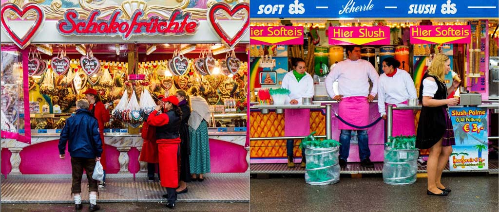
In the first book I used full bleed on every page, only leaving a blank page to signify chapter beginnings.  The photos were sequenced into a narrative order that stepped from the joyful start to the fest to the drunken distressing end that many attendees come to.  I paid more attention to the narrative sequence than the visual one.  The three examples above illustrate the problem this created for the viewer.  There is simply no space to breath, the images violently collide.  In the physical book this is less of a problem, but is still challenging.  There were also too many images, in the above spreads there is redundancy of message.  The third spread shows that opposing full bleed can work, the symmetry of the images and the similar colour palette work together.  In the first two cases, the simply inclusion of some white space might make the pages work.

My intent from the start was to present the confusion and visual violence of the fest, I succeeded, but too much. In the second book I went in the opposite direction, think in terms of an art presentation, one photo to every spread and plenty of white space:


Addition of a caption and image number was intended to balance the use of space on the page and to experiment with the use of text.  Captions are dangerous things, they coalesce the meaning of an image, adding context, but taking away interpretation.  Once I add a caption I take control of the image and direct the reading, without the caption the viewer is free to read the image within their own context, not mine.  This is a strategy that can be used particularly in documentary photography where the publisher wishes to make a very specific statement and remove ambiguity.  In my work that is not really needed, the caption robs the image of some of it's mystery.  I will not do this for book 3, although I am glad I did for book 2 as it helped me to learn this important lesson.  

Well that is my retrospective on book design.  The salient point is that this is not a simple problem to solve, a books layout has huge impact on how photographs are read, get it wrong and no matter the quality of the images, they are lost in the confusion of the book.  For my current project I need to find a balance, I need to convey the chaos of the fest, but not in a chaotic fashion.  Conversely I do not want to present these photographs as individual art works as I did with the second volume, one or two maybe, the one illustrated here, certainly.  I need to mix up the pages, but design the page around the photograph and what I am trying to say.  I am reluctant to put more than 1 photograph on a page, although never say never.  I have a series of images created as icons, which might work in a two page spread that shows 32 images!  Much to think about.

Finally, once again, I am very much in debt to my fellow students in this project, their feedback is a key element in how I am developing this project.  having a group of people who are prepared to spend their time reviewing my work is both humbling and inspiring.  Thanks to all!

Tuesday, October 23, 2012

Odds and Ends

The past two weeks have been a strange combination of nothing to do and being extremely busy.  Catching a bad bout of the Wiesn Grippe (Oktoberfest Flu) , a common problem in Munich in the weeks after the fest finishes, really slowed me down.  It is noticeable here that there is a spike in illness immediately after the fest , simply a result of millions of strangers visiting the city during a very short span of time, bringing with them their money, culture and viruses.  My doctor told me to stay home, keep warm and avoid stress, concerned that I would develop worse problems otherwise.  This was as ill as I have been for 20 years, but still left me frustrated and needing to fill in the time.

I started out watching the "Shock of the New" on YouTube and then for a third time sat through the excellent BBC series "Genius of Photography", a good reminder in these days of all that is good about the beleaguered institution.  I always see new things that I had missed and get a good jolt of encouragement from these videos. I also finished reading "Criticizing Photographs" by Terry Barrett, something I found rather uninspiring and soulless.  The books content was good and the information presented of great value, it was simply the turgid style and sense that he could have said what was needed in a third of the space used that let it down for me.  Perhaps this was a case of reading a textbook that is designed to support study rather than be a bed time read.  It'll find a place on my reference shelf and undoubtedly come in useful when I need to do some more considered and advanced writing about photography:


The rest of my time was spent trying to get my head around the photographs I have taken at the Oktoberfest using the creation of a book as a vehicle for selecting, sequencing and contextualizing the material.  This was a hard but pleasant task to complete.  I deliberately adopted quite a strong design and narrative stance for each of the two books I have so far pulled together and asked the OCA community to help by commenting. The comments were as varied as the people, some loving the chaos of the packed multi-image first volume, others preferring the second with its more measured pace and fewer images.  In both cases I received a huge amount of useful advice, feedback, and suggestions, all of which I am going to mull over and then invest into a third and final volume that will balance the two approaches and perhaps introduce a few new ideas.  In the mean time, book number 1 arrived back from the printers:


As I expected it looks better in the flesh than on the screen, the jarring effect of two images blending into one another is somewhat mitigated by the gutter, but I do see the point that I need more space for some of the images to breath and avoid overwhelming one another.  This arrived 2 weeks sooner than I expected, hopefully the same will be true of the second volume.  Having both in hand will be very handy when designing the third.

By the weekend I was fit again and able to join the land of the living once more, which in my case meant the land of the nerds, I spent the weekend rejigging my digital darkroom.  As someone firmly wedded to Digital photography the stability, performance, and quality of my editing setup is as important to me as having a decent camera and lenses.  My desktop is a 3 year old (then) top of the range HP machine with 8GB of RAM, a couple of 1TB internal drives, and an Nvidia GTX 260 graphics card.  It has been getting slower and slower as each new software upgrade arrived and the size of my RAW files grew.  So on Saturday afternoon I increased the memory to 16GB and installed a new boot drive, a 240GB SSD.  Swapping the boot drive to the very much faster solid state device meant a complete rebuild of the OS and re-installation of all software.  This took the better part of Saturday and Sunday, but left me with a substantially quicker system.  I was also able to reorganize my storage, so that the 2 x 1TB in the machine now carry all my personal data and trip based photography, whilst a 4 x 1TB RAID 5 external disk array carries my day to day photography.  This then enabled me to change my second external drive array a 2 x 2TB RAID 1 array to a RAID 0 backup device for the rest of the system.  I now have software running that backs up all my data to this array.  I started the backup 2 days ago, still going, 2TB copied already.  

OK, overkill, I know, but I am a belt and braces man when it comes to my photographs, they are very precious to me.  Hopefully this upgrade will now keep me going for another 2 or 3 years before I do something stupid and install Windows 8.

Otherwise, I am turning my thoughts towards getting back to the more prosaic elements of the course, completing some of the projects that really should come before assignment 2 and thinking about the future.  Today I learned something from the student forum that I am not to sure about.  I did not expect the final year courses to change from the current YoP and Advanced, however, a complete overhaul is planned for the 2013/14 academic year.  This is troubling me on two fronts, the first is that I was expecting to complete this course late spring/early summer and do not really want a large break prior to starting a new course.  However, I could fill the gap usefully by either slowing down on this course or even adding a further Level 1 or 2 to my studies.  I have had in the back of my mind the Visual Culture or Western Art courses to supplement my rather rudimentary knowledge of both.  The latter would be a fun way to spend the winter, especially in a city with such a rich artistic heritage as Munich.    I need to ponder this - after watching the Shock of the New I have a renewed interest in the Arts beyond Photography.

My second concern is more worrying to me and that is the split of the Year 3 courses from two into three elements, with one third being portfolio development (for want of a better term) , the second being a theoretical study, and the final part being professional practice.  The first two elements I have no issue with, it is the last one that I am not sure about.  I am not interested in becoming a professional photographer, the loss in income would be too great and starting again at the bottom at my age is not why I started with the OCA.  I am in this to keep myself fresh and to develop an art practice that I can carry forward as a personal sideline to my normal working life.  OK, it might be nice to make some money, but that is not my motivation.  The notes I have read about this element of the course talk a lot about legal issues, business practices, and positioning oneself within the photographic business.  The question is, in what country, UK law and practice is of little interest to me, the German attitude to photography, both legally and culturally is very different to that of the UK.  I need to dig a little deeper here and make a call on whether to try and cling to the old model or go with the new.  I just hope the OCA takes on board the multinational base of its student body and avoids the UK centricity of the current level 2 courses in designing the new level 3 curriculum. 

Monday, October 22, 2012

Assignment 2: Truth

Ever since the start of my studies with the OCA, the question of truth and photography has continued to fascinate me, both from a philosophical standpoint and a practical one.  It took me quite a while to completely discard the idea that a photograph was a mirror on reality. I intrinsically accepted the idea of photographic evidence, i.e. that a photograph presents a truth.  I was a Photoshop user and so understood that a photograph could be manipulated, but that was the extent of my mistrust. As a casual photographer and consumer of imagery I had never considered the question of what lies outside that rectangular frame and how the person holding the camera decided how much of it I would or would not see.  In a sense this is an obvious idea, photographic meaning is as much defined by omission as by inclusion, however, culturally we live with this idea of the photograph as an object that conveys truth.  

With this assignment I am stepping beyond the frame in questioning the use of photography as a mirror on society.  Here my concern is not so much the single image, but how images combine to portray the mood of an event, asking questions about the non-photos, the images  that we never see?.  When an event is considered newsworthy photographers are dispatched to cover it.  They take their photographs and then transmit the images back to the publication for inclusion or exclusion.  Editorial policy, politics in another word, kicks in and the newspaper runs the images that best conform to their view of what they want to say about the event.  

This extends beyond simple editorial bias to direct political interference, the US governments refusal to allow photographs of returning soldiers coffins being a prime example.  In my case the subject is much more prosaic, but these questions are still extremely valid for me.  The Oktoberfest is normally presented in the context of tradition or boisterous fun, I rarely see any photographs that look behind the tents and capture the vomit, the ambulance crews, the violence.  This year 45 people were arrested for using a liter beer glass as a weapon.  I have witnessed this myself, years ago, someone smashed a glass into a guys face standing near me - I have never seen so much blood before or after. More people needed medical treatment than every before this year.  However, this only appears as a foot note in news coverage and there is an absence of photographic record.  Google Oktoberfest pictures and get image after image of beer and traditional dress, add the word violence, almost nothing.  It was very noticeable for me that as soon as any violence occurred security was as interested in preventing any photographs as capturing the offenders.  Image is everything and the fest is very lucrative to the city, they need to maintain the idea of clean but drunken fun. 

In working this assignment I was very conscious of wanting to portray the good and the bad of the event, I love to drink and have had some marvelously drunken times at the fest, however, I have also witnessed extreme violence and many dangerously drunk people.  I now have a large body of photographs that span the full spectrum of the Oktoberfest experience, the question is what slant I want to put on it.  No matter how careful I am at retaining a balanced view, my own prejudice will infect the set, in fact it must, this has to be a personal response to the event.

In this post I am not trying to answer that question yet, but have gone through the process of selecting 12 images as a straw horse and then done that a further 5 times.  Each time I have adopted a bias and tried to build and sequence a set that meets that bias.  I wish to explore editorial interference in how a photographic portrayal of an event is built.  In each case my focus is still on the people attending, although some sets are less social documentary than others.

Upbeat:  Here I am trying to take a positive look at the fest, but still including the affects of the alcohol.  

Downbeat:  here I am really dwelling on the evils of drink, the violence, the sickness, the stupidity

Propaganda: Now I have taken the stance of working for the city to positively portray the event

Friendship:  The fest is a social event and with these images I have tried to portray the camaraderie of the attendees

Bleak:  With this set I am really looking under the carpet and showing how tawdry and grim the fest can be. The weather helped a lot.

Vibrance:  Finally another popular theme for photographing the fest, the colour and frenetic activity.  This is probably closest to how I experience and remember it.

Each set of photographs carries a different message.  If someone asked me to send them photographs of my experience at the fest I could send any of these and still be telling the truth, but only a piece of the truth and the piece that I choose to share.  There is nothing new here and in a sense everything that I have written about is plainly obvious, but strangely we do not really take this on board.

I finish with the observation that our view of the past is created by photographs made by people with a clear bias on how they want their subject to be seen.  Walker Evans is famous for recording the poverty of 1930's rural America, however, the view he left us has as much to do with his personal stance as the actuality of what was recorded.  The subject of his most iconic image,  Allie Mae Burroughs, stated quite publicly that he constructed these images of poverty, moving things around the house, changing how people were clothed.   These are great photographs, but they are not a realistic reportage on the events or conditions of the time.  They are not history, they are pictures.